
SO MANY FONTS. It's entirely overwhelming. Over the next few
posts, we'll be working on your introduction page and table of contents. This,
obviously, requires a font choice. There are plenty of pretty fonts out there,
but how do you know you're picking the right one?
Whether you're writing a single pattern or an entire book,
the font you choose can do a ton for you. It can create a mood of
professionalism, quirky-ness, elegance, modern design, pretty much anything you
can imagine. Now that's overwhelming. No worries, I'll help you out.
As a basis for the tips I'll provide, I want to explain the
four basic types of fonts.
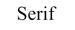
I. Serif
This font has little itty bitty hooks and feet on the ends
of the lines that create the letters. A serif font creates a very classic,
timeless look and feel.
II. Sans Serif
II. Sans Serif
This font has nothing at the ends of the letter's lines. A
sans serif font creates a very clean, modern, almost tech-y look and feel.

Everything that imitates cursive writing can be considered a
script font. This type of font creates a very elegant, ladylike look and feel.

Anything that doesn't fit into the three categories above is
most likely a decorative font. Decorative fonts can be just about anything, so
the look/feel of these fonts varies.

I did some research on fonts and selecting the right one and
it all boils down to three things. They are: 1) Readablility 2) Suiting the
creative "mood" 3) Filling the space proportionately.
1. Readablility
It doesn't matter what you write, no one will care if they
can't read it. The most important thing is READABILITY. The struggle here is
that YOU know what you’re writing, so you’re able to easily read whatever font
you choose. Send a few of your font choices to your friends or show your family
and get their input on the readablility. Or, you can post in the Ravelry Group for
this blog and get input from the lovely people there.
2. Suit the creative “mood.”
Remember the things I mentioned about the “look” and “feel”
of each type of font? It’s important that you take these things into account
when designing your book. If you’re writing patterns themed around Star Wars for example,
it’d be best to use a sans serif font because, depending on the particular font
you choose, it can create a modern, futuristic vibe.
3. Fill the space proportionately.
This is hard to explain, so I’ll show you.
If you have a tall, narrow space to fill, choose a tall,
narrow font to fill it! This will just make things look “right” and it’ll make
designing a ton easier.


All right, now for some general tips to make your words look
lovely:
-Keep it simple. Don’t go crazy with 50 different fonts
throughout your entire book. Keeping with 2 or 3 fonts throughout is a
fantastic way to tie your book together.
-Choose one font and one font only for your main body of
text. All your tutorial text, patterns, headings, and subheadings should be one
easy-to-read serif or sans serif font. Serif and sans serif are best because
you can make them bold for your headings and subheadings. Get fancy with your
titles, but keep the bulk of your text the same.
-Pay attention to cultural norms. Some fonts have been used
for one very specific thing or by a specific brand for a long time. Don’t use a font that conjures up
ideas of something that isn't your thing. Again, this may take input from
friends and family, or the Ravelry group.
-If you’re deciding between two fonts, type up an “abc” page
in a word document. Simply type out the whole alphabet (uppercase and
lowercase) on a sheet of paper, print it out, and give it some thought. Put it
up on your fridge for a while and see how the different fonts make you feel.
This can really help you get an overall view of how the font will look typed
into a large body of work.
Okay, that's all I have on fonts! Oh, one more thing--if you're looking for fonts, definitely check out Da Font. It's a fantastic website full of free fonts you can download.
I hope this was helpful to you! Don't be afraid to leave your questions and comments below!
Until next time,
Grace
Okay, that's all I have on fonts! Oh, one more thing--if you're looking for fonts, definitely check out Da Font. It's a fantastic website full of free fonts you can download.
I hope this was helpful to you! Don't be afraid to leave your questions and comments below!
Until next time,
Grace